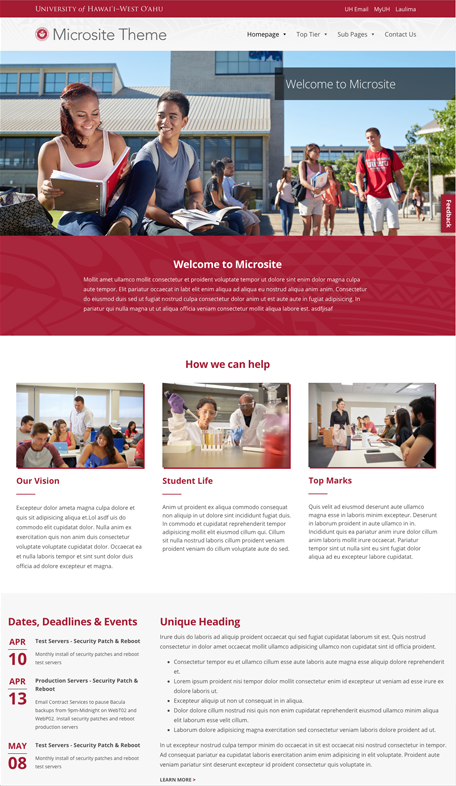
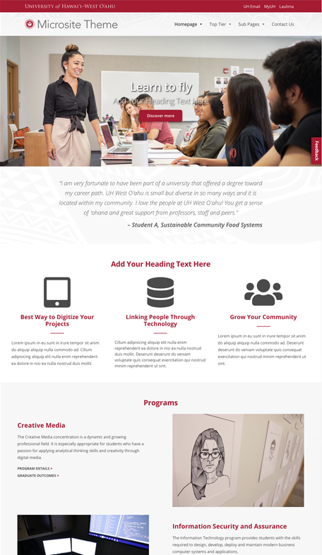
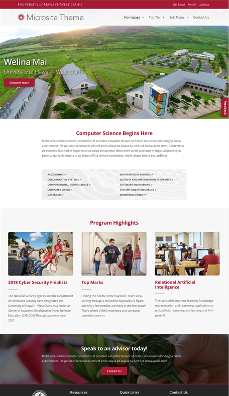
Microsite
Supported UH West Oʻahu microsites will be incorporated, linked, and/or recognized on the campus site. Alternatively, websites that are not supported nor approved by the Communications Department will not be linked from the campus site. Interested UH West Oʻahu units should fill out a Microsite Request Form.
A microsite is a website that offers more detailed information for a specific degree, certificate, concentration, campus support-function departments that are officially affiliated with UH West Oʻahu. Microsites are meant to complement the campus website.
Theme/Templates
UH West Oʻahu developed a custom WordPress theme – UHWO Microsite Theme – that offers a selection of templates with customizable elements. The UHWO Microsite Theme follows the UH West Oʻahu brand system and serves as a good example of all components of the design system working together for a consistent, cohesive look.
Color
Our microsite templates utilize a set of colors that is defined in our UH West O‘ahu color palette. This color palette was developed to maximize color contrast and visibility that is ideal for the web applications.

Black
CMYK 75 68 67 90
RGB 0 0 0
HEX #000000

Darker Gray
CMYK 71 65 64 70
RGB 37 37 37
HEX #252525

Dark Gray
CMYK 66 59 58 40
RGB 73 73 73
HEX #494949

Gray
CMYK 60 51 51 20
RGB 102 102 102
HEX #666666

UH West O‘ahu Red
CMYK 23 100 87 16
RGB 167 25 48
HEX #A71930

Off-white
CMYK 2 1 1 0
RGB 247 247 247
HEX #F7F7F7

White
CMYK 0 0 0 0
RGB 250 250 250
HEX #FFFFFF
When choosing colors, consider an audience who may be color blind or have low vision. Using foreground and background colors with high-contrast is not only easier to read, but allows content to more accessible.
Use dark text on a light background
 Contrast ratio: 14.31
 Contrast ratio: 6.94
Use the UH West O‘ahu Red on a dark background
 Contrast ratio 2.06
 Contrast ratio 2.06
Never use color alone to convey information. Whether delineating a clickable link, highlighting an important word or enhancing a graphic element, combining the color differentiation with a size, shape, or typeface styles change such as bold will be more accessible.
Typography
By consistently tying typographic styles to appropriate functions on our microsites, we create a clear visual pattern for students, faculty, and staff. Open Sans is the standard typeface for UH West Oʻahu on the web. Open Sans was optimized for print, web, and mobile interfaces, and has excellent legibility characteristics in its letterforms.
Remember that the browser, not the designer, controls the display of type. That’s why Helvetica/Arial is a suggested alternative typeface — these neutral type styles don’t require adjustments like extra line spacing.
Open Sans is a free Google Font and can be downloaded at: https://fonts.google.com/specimen/Open+Sans
Typeface
Primary Typeface
Open Sans
Open Sans Light 300
ABCDEFGHIJKLM
abcdefghijklm
Open Sans Light Italic 300
ABCDEFGHIJKLM
abcdefghijklm
Open Sans Regular 400
ABCDEFGHIJKLM
abcdefghijklm
Open Sans Regular Italic 400
ABCDEFGHIJKLM
abcdefghijklm
Open Sans Semibold 600
ABCDEFGHIJKLM
abcdefghijklm
Open Sans Semibold Italic 600
ABCDEFGHIJKLM
abcdefghijklm
Open Sans Bold 700
ABCDEFGHIJKLM
abcdefghijklm
Open Sans Bold Italic 700
ABCDEFGHIJKLM
abcdefghijklm
Sizes and Usage
Consistency and utilization of logical hierarchies ensures that elements are easily recognizable. Our text sizes, styles, and layouts balance content and foster familiarity.
Heading 1
Suggested usage
Top level headers and page titles.
Basic Properties
Font size: 38px
Font weight: 700
Color: #a71930
UI properties
Line height: 46px
Margin top: 16px
Margin bottom: 24px
Heading 2
Suggested usage
Subheadings on a page that identify a key section or functionality.
Basic Properties
Font size: 30px
Font weight: 700
Color: #252525
UI properties
Line height: 36px
Margin top: 16px
Margin bottom: 12px
Heading 3
Suggested usage
Titles of subsections that fall under subheadings.
Basic Properties
Font size: 24px
Font weight: 600
Color: #252525
UI properties
Line height: 30px
Margin top: 16px
Margin bottom: 12px
Heading 4
Suggested usage
Titles of sections that full under subsections.
Basic Properties
Font size: 20px
Font weight: 600
Color: #252525
UI properties
Line height: 24px
Margin top: 16px
Margin bottom: 12px
Paragraph Text – UH West Oʻahu has been the fastest growing school of its type in the nation for the past two years, according to the Chronicle of Higher Education’s annual almanac. Enrollment surged 239 percent between 2006 and 2016, or the most by any public baccalaureate granting institution. In 2017 UH West Oʻahu led the list of fastest growing colleges.
Suggested usage
Website’s main text
Basic Properties
Font size: 16px
Font weight: 400
Color: #494949
UI properties
Line height: 28px
Margin top: 0
Margin bottom: 16px
Don’t choose a heading because you like how it looks
Attend the
Career Fair
at Campus Center, today!.
Don’t change the properties of your headings
Heading 2
Heading 3
Spacing
Our spacing system helps to create a consistent look throughout our microsites by avoiding the use of arbitrary values. It assists in speeding up the development process because the space between elements has been pre-determined and fine-tuned. We used 16px – the default typeface size in every major web browser – as our base value. Elements get progressively more spaced apart as we move up the scale, ensures consistency across this design system.
Components
Our components are a collection of interface elements that can be reused across UH West Oʻahu’s microsites. They implement our design system’s brand, typography, color, and spacing.
Links
Links are used to embed actions or pathways to more information in a sentence. Links should consist of text that clearly describes either the action that user will take or the location/file they’ll navigate to. They should only be used within a sentence.
UH West Oʻahu links are our red and should be underlined to meet WCAG 2.0 level A guidelines: F73.
Example
[…] That responsibility, derived from our Value Proposition, goes beyond the reporting of such information to a deeper obligation: to ourselves, our students, and society.
Color: #A71930
Font weight: 400
Text decoration: underline
Use for linking to
- Same page anchors
- Webpage
- Microsites
- Affiliated websites
- External website
- Files
- Emails
Not to be used for linking to
- Important webpage or websites
- Actively submitting a form
UH West Oʻahu’s Styled Link
The style link should be used as a standalone link to another page or section of your website. This type of link should never be used in the middle of a sentence.
Example
Current Students
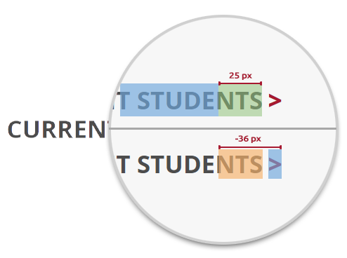
Color: #4C4C4C
Font size: 14px
Font weight: 700
Text transform: uppercase
Padding right: 25px
Properties (:after)
Content: >
Color: #a71930
Font Weight: 800
Margin right: -36px
Margin left: 3px
Use for linking to
- Important webpages
- Important websites deemed important for user to see but not necessarily click.
Not to be used for linking to
- Same page anchors
Buttons
Use buttons to trigger actions and links.
Font size: 16px
Font weight: 600
Padding top/bottom: 12px
Padding left/right: 32px
Margin top: 8px
Margin bottom: 16px
Margin left/right: 0px
Border: 1px
Border radius: 8px
Text align: center
Gray
UH West O‘ahu Red Outlined
Don’t use unapproved colors
Don’t use gradients
Use for
- Actively submitting a form or search
- Linking to webpage or website that is deemed important for user to click.
Not to be used for linking to
- Same page anchors
- Email applications
Tables
A table is a good way to logically structure content in a grid to make it easier to see relationships and to facilitate understanding.
Best used for
- Tabular data
- Showing large amounts of discrete data with many variables
- Showing values across multiple categories and measures
Not to be used for
- Creating web page or section layouts
- Positioning elements a certain way
Alignment
Consistent vertical alignment is essential for fast visual comparison between values in a table. We recommend that you left align non-numeric values and right align uniform, numeric values.
5 Largest Bachelors Degree Concentrations by Enrollment| Concentrations | Fall 2018 | Fall 2017 |
|---|---|---|
| Psychology (BA) | 285 | 302 |
| Accounting (BA) | 241 | 245 |
| Health Care Administration (BA) | 223 | 223 |
| Management (BA) | 197 | 187 |
| Creative Media (BA) | 159 | 125 |
Distinct Properties
Cell padding top/bottom: 16px
Cell padding left/right: 24px
| Rank | Name | Brand value | Change from last year | Last year’s rank |
|---|---|---|---|---|
| 1 | Amazon | $150.8 billion | +42% | 3 |
| 2 | Apple | $146.3 billion | +37% | 2 |
| 3 | $120.9 billion | +10% | 1 | |
| 4 | Samsung | $92.3 billion | +39% | 6 |
| 5 | $89.7 billion | +45% | 9 | |
| 6 | AT&T | $82.4 billion | -5% | 4 |
| 7 | Microsoft | $81.2 billion | +6% | 5 |
| 8 | Verizon | $62.8 billion | -5% | 7 |
| 9 | Walmart | $61.5 billion | -1% | 8 |
| 10 | ICBC | $59.2 billion | +24% | 10 |
Distinct Properties
Cell padding top/bottom: 8px
Cell padding left/right: 16px
Background color
(only even rows): #ECECEC