Accessibility
UH West Oʻahu takes special care in ensuring that our digital products are accessible. Accessible content is material that provides an equal experience for all users, including those who may require assistive technology (for example, computer screen readers). The Americans with Disabilities Act (ADA) and Section 508 of the Rehabilitation Act requires that all media used or purchased by public agencies receiving federal/state funds be accessible.
Making UH West Oʻahu digital media accessible not only complies with ADA law, UH’s Voluntary Resolution Agreement, and UH System guidelines, but keeps to the spirit of universal design.
Remember:
- Accessibility is not just about passing checkers. Be descriptive but concise when describing complex figures.
- Accessible design should be a balance of function and form. Never sacrifice function for form or design.
Web
Structure & Hierarchy
Proper headings and hierarchy should reveal structure and how content is related. Having a game plan will help deliver a clear and concise message.
Place content by level of importance
Important content should always be first. Your user’s time is important so organization is key. Do not nest important items in areas where it may be glanced over.
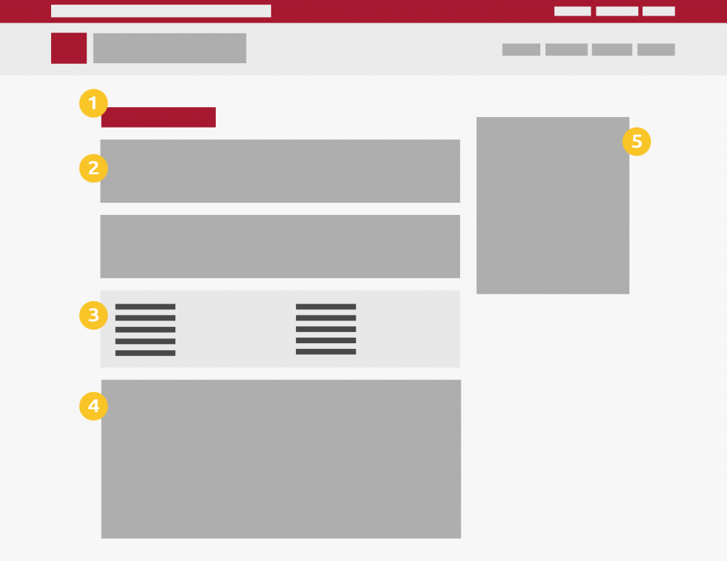
Have logical heading hierarchy
Users who use assistive technology may navigate pages with heading levels. Many of us do this subconsciously when skimming a page and directing our attention to the visual cues of headings (for example, larger font-size, heavier font-weight, etc). It’s essential that content is tagged and organized in a logical heading structure so assistive technology can leverage it to do the same. Ask yourself:
- What is the overarching theme or subject of the page? This will likely be the heading level 1.
- How can the rest of page be divided? What are those headings? Those are likely the heading level 2s
Other considerations:
- Do not skip heading levels. Use them in order.
- Headings should not be used purely for cosmetic purposes.

H1, H2, H3, H3, H4
H2, H1, H3, H3
Keyboard Navigation
In some situations, users are simply unable to navigate documents or applications with a mouse. Ensure that users can navigate through your product with a keyboard in a logical order. Illogical order can make navigating a nightmare and effectively makes the product unusable for keyboard users.
Keyboard users should be able to:
- Navigate to all components available to those with a mouse.
- Identify where the user is in the document.
Images
Using Alternative (ALT) Text
Images are often used to complement surrounding text and provide additional information. Neglecting to provide information on such images would mean the experience is no longer equal for those who use screen readers. Provide meaningful alternate text so screen readers can describe the image.
Correct ALT text
“Student wearing safety equipment conducting an experiment in lab while professor observes.”

Incorrect ALT text
“UH West O‘ahu student in lab.” or “Campus scene in laboratory.”
Images that contain information
If the image contains information relevant to the document, provide meaningful alternate text. Meaningful alternate text is tricky. Consider the following when writing alt text:
- Avoid generic descriptions like “Image of Newspaper”.
- Imagine giving a presentation with nothing but that image on the slide. How would you describe the image? You may then feel inclined to share the title of the newspaper and the article headline at a minimum.
- Be descriptive yet concise.
- Often times, surrounding text reiterates some of the details in images. There is no need to repeat in great detail if that is the case.
- Alt text for images are not meant to be paragraphs or essays. Effective alt text should quickly explain what the image is and its relation to the rest of the content. Then send the user back to the rest of the content.
Complex images
Some images provide relevant information but cannot be explained quickly. For example, a map or a flowchart. Instead of providing all the details in the alt text, refer users to the section of the page that explains the image in more detail.
Decorative images
If the image is purely a design element and provides no actual information to the rest of the document, then provide a blank alt attribute. For example, alt=””.
Colors
Use high contrast
Proper use of colors and color contrast ensures that your text is legible for all users, especially those who are visually-impaired. When selecting appropriate colors for your design, it’s important that your selection has enough contrast. Never pair light foreground text colors with light background colors (and vice versa, dark on dark). Make sure all text and background meet the WCAG threshold ratio of 4.5:1 for standard text and 3:1 for larger text.
Decorative images and disabled states don’t have contrast requirements.
Don’t use type in non-ADA Compliant combinations

Don’t use tinted type over a light background

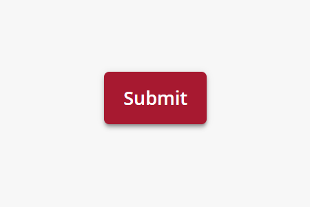
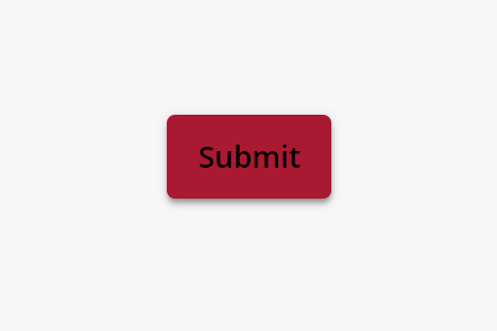
Buttons
Buttons are simply dressed up links that must abide by the same text color contrast rules set forward by the WCAG threshold ratio, seen in the colors section above. You should always use light buttons on dark background and dark buttons on neutral and/or light backgrounds.
AA passed: 7.43:1 contrast ratio
AA failed: 2.82:1 contrast ratio
Unique Button (or Link) Text
If there are multiple buttons on a page that uses the same text, make each button text unique whenever possible. The same behavior applies for links. Unique button text will provide screen readers with a clear distinction of each button’s function. Just like headings, screen readers can navigate via the interactive elements on a page in which case surrounding text that would otherwise provide context on a button’s function will be skipped over.
When unique button (or link) text is not possible or impacts design, leverage aria-labels to provide the necessary additional details instead. Aria-labels are hidden to browsers but available to screen readers to help differentiate functions.
Descriptive link text
First Time Freshmen
Apply as First Time Freshmen
International Student
Apply as International Student
Military
Apply as Military
Use aria-label
First Time Freshmen
<a src=”…” aria-label=”Apply as First Time Freshman”>Apply Now</a>
International Students
<a src=”…” aria-label=”Apply as International Student”>Apply Now</a>
Military
<a src=”…” aria-label=”Apply as Military”>Apply Now</a>
Repeat link text
Links
Links require special attention. In addition to color contrast requirements for text, links need to be styled with additional consideration so they won’t be easily overlooked.
Using only color may fail to indicate a link to color-impaired users (WCAG 2.0: Success Criterion 1.4.1 (Use of Color). In addition to color, you must use one of the following techniques to meet WCAG 2.0 level A guidelines: Underline or bold (F73) OR a change in visual feedback when a user points or tabs to the link: underline, change in font style to bold or italics, or an increase in font size, if your text meets proper color contrast (3:1 or greater measured against surrounding text) G183).
Underline
A brand is the public image, reputation, or identity that is shaped by the experiences our students, faculty, staff, alumni, and community have when they visit our campus and interact with our people and programs.
Bold
A brand is the public image, reputation, or identity that is shaped by the experiences our students, faculty, staff, alumni, and community have when they visit our campus and interact with our people and programs.
Don’t remove text decoration
Hawaiian Diacriticals
The Hawaiian language is currently unsupported in most screen readers, so screen readers will struggle to read words that contain Hawaiian diacriticals such as kahakō and ʻokina. To help screen readers work around its current limitations, use the aria-label property along with a span element in HTML. If youʻre not comfortable with HTML, we highly recommend using the ʻŌlelo Translate tool.
Do
West <span aria-label=”Oahu”>Oʻahu</span>
Don’t
Portable Document Format (PDF)
As a general rule, we all should try to limit the use of Portable Document Format (PDF) to display web content. Unless the information includes many complex tables, graphs, or charts, content should be displayed with HTML if at all possible.
Knowing that, we understand that PDF is a widely popular document type on many websites. As such, PDFs are no exception to accessibility guidelines. Fortunately, accessibility guidelines for PDFs are identical to web pages (for example, structure, headlines, etc). Users navigate PDFs very similar to how navigation is with web pages. To assess the level of accessibility of your PDF, please refer to Adobe’s article on using the Adobe Acrobat Pro DC Accessibility Checker.
See how to make your documents accessible with guidance from the UH System.
Additional Resources
When in doubt, refer to the following guidelines:
- UH Information Technology Services website – https://www.hawaii.edu/access/accessible-content/webaccess/
- WebAIM – http://webaim.org/
- Web Accessibility Initiative – https://www.w3.org/
Video
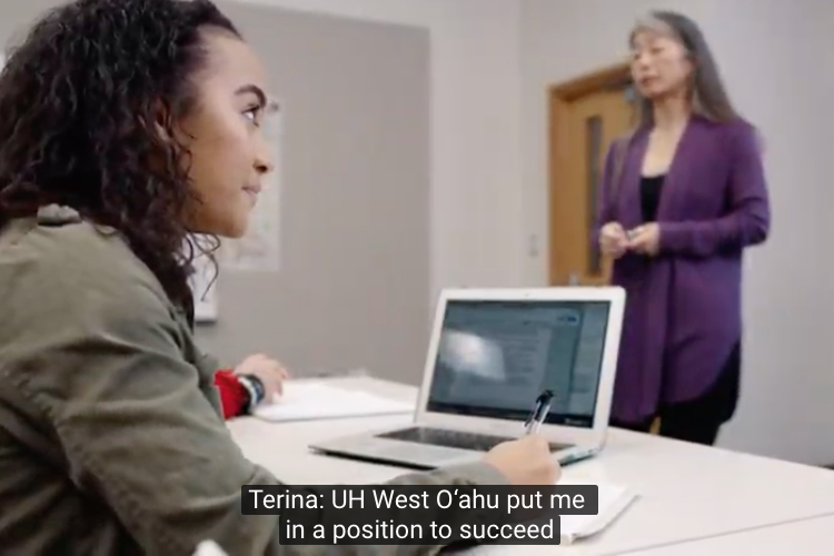
To insure UH West O‘ahu videos are accessible, all video content should contain either closed- or open-captioning. To activate closed-captioning, locate the closed captioning (CC) symbol, usually in one of the corners of the video, to toggle it on/off.
What are captions?
Captions:
- Display all audio information including sound effects or music
- Identify speakers
- Are displayed in the same language as the audio
- Can be either “closed” (able to be turned on or off by the user) or “open” (on all the time)
Identify who is speaking in the video (this includes the narrator).
Display audio information such as applause, sound effects or music.

You can tell if the video you are watching has captions by clicking on the (CC) symbol in the video playback window. Remember that auto-captioned content will likely have basic errors, especially capitalization, punctuation issues and incorrect Hawaiian word translation.
YouTube and Auto-sync
When using YouTube’s site to display your video, closed-captioning will be automatically generated. This feature is called auto-sync, and though at first glance may seem acceptable, it will usually include errors and typos. This is especially true with Hawaiian words and will also not correctly display the diacritical marks. Please review and edit all captioning before making your video live.
Social Media
While social media platforms assumes most of the responsibility for making their sites accessible, it doesn’t relieve us from doing our part. A lot of the appeal for social media is due to the fact that the content is so image and video-rich. Because of this, it is critical we remain diligent about providing alternate text and captions for any photo or video whenever possible.
To make your social media content more accessible, refer to the following support articles:
- Twitter: How to make images accessible for people
- Instagram: How do I edit the alternative text for a photo on Instagram?
- YouTube: Edit captions
- Facebook: How do I add or remove captions on my video?
- Facebook: How do I edit the alternative text for a photo?
While closed-captioning may not be available on all platforms, consider utilizing open-captioning (burning in the captions in videos). This benefits not just the hearing-impaired but also users who choose to view content with the audio muted.