Typography
Typography plays a role in the look and feel of our products. As a higher education institution, we want to use typography (or fonts) that reflect our quality, contribute to our brand identity, and bring consistency across all media.
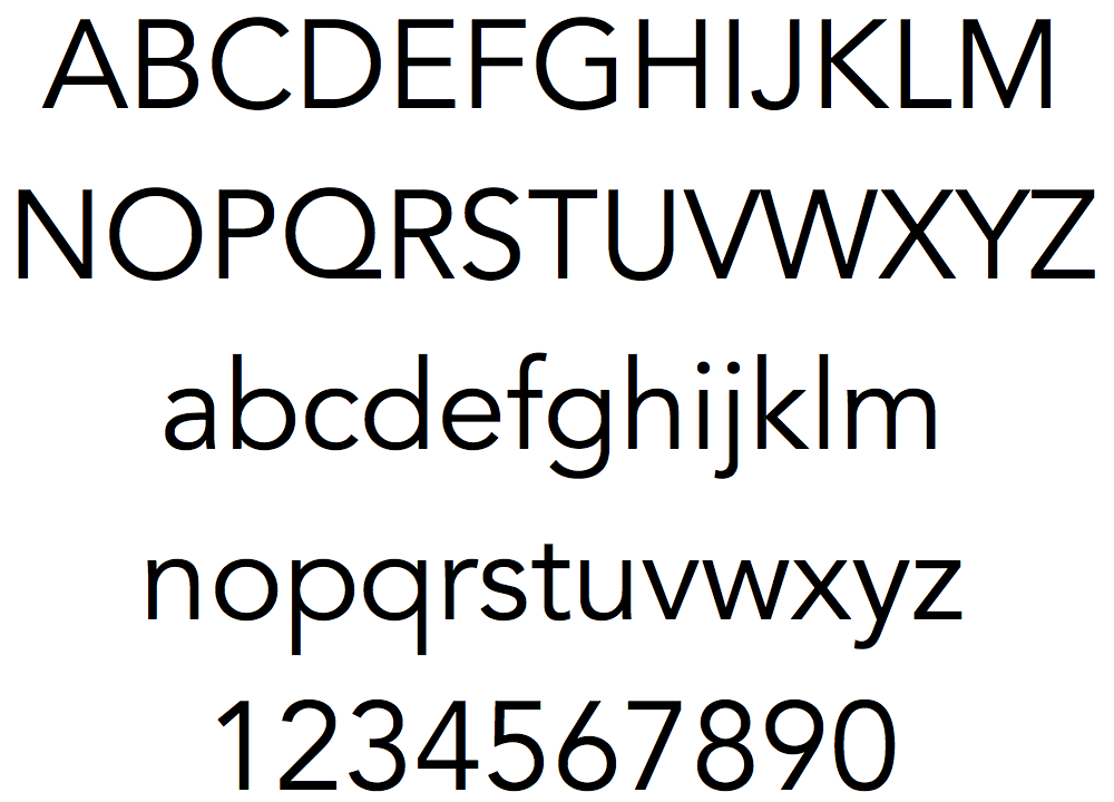
UH West O‘ahu’s primary font is a sans-serif type style entitled Avenir (Open Sans for web). This sans-serif font is clean, modern, and easy to read. It is also a legible font that may assist accessibility challenges.
Other than the primary font, UH West O‘ahu also uses other font type styles as well. These approved fonts are listed below.
Typeface
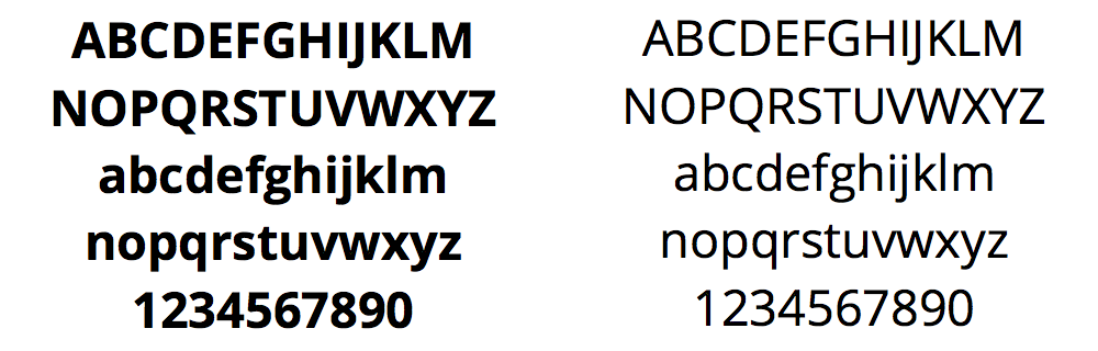
Avenir font family is the primary font for printed materials. It is REQUIRED for all major marketing materials and RECOMMENDED for other print pieces.
For Print
For Web
Open Sans font family is the recommended font for web applications. Details on typeface within UH West Oʻahu’s design system are in our microsite application section. If Open Sans can’t be used, we recommend using the Helvetica or Arial font family as an alternative on webpages.
When the Open Sans font is not available, you many use Optima, Zapf Humanity, Helvetica or Arial.
Other Approved Fonts
For select specialized situations, a serif styled font entitled Minion Pro (Crimson Text for web), a collegiate styled font entitled Freshman and a script font entitled Gloss & Bloom are used. The use of these fonts are normally affiliated with Student Affairs marketing materials and are usually only utilized by the Communications Department.


Typesetting
In print, designers have the ability to adjust spacing between letters, words, and lines of type. Use this ability thoughtfully and carefully. Ensure that the layout is easy to read and that the content is appealing. Always consider ADA accessibility when setting your type.
For Print
- Use Avenir Bold with all caps for immediacy and emphasis in headlines.
- For a more restrained look, use sentence case in headlines.
- Never use custom fonts for body copy. Even in print they are only legible in display sizes.
- Use Avenir Book for large amounts of text.
- Use generous leading, three to five points greater than the size of the type.
- Never set body copy smaller than 10 point, even for young audiences. (For older audiences use 11 or 12 point).
Set body copy flush left, ragged right. Don’t center or justify.
For Web
- Use Open Sans Bold for H1 and H2 headlines.
- Use Open Sans Semibold for all other headlines (H3, H4, etc.).
- Use Open Sans Regular for body copy.
- Details on sizes and usage UH West Oʻahu’s design system are in our microsite application section.
Don’t
Don’t non-ADA Compliant contrast colors

Don’t use red type

Don’t make your layout too dark

Don’t create your own palette or gradients